When I first started coloring in October 2015 (no, I didn’t color much as a child) I did not know that not every coloring book was created equally. I initially fell prey to the self-publishing mill that uses stock art printed on cheap paper to crank out books by the thousands. (No knock on the real artists who rely on self-publishing their line art and do it well. I myself have used self-publishing services).
By the time I was ready to try grayscale, I was weary because the artwork consists of photographs that have been “edited” into a grayscale version. Since the nature of grayscale books requires compilation of these images, I was afraid of ending up with sloppy work. So, I turned to the friendly, knowledgeable folks in online coloring groups to help me find a good book/artist in order to give grayscale a try.
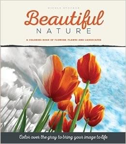
A couple of names rose to the top repeatedly, and that is how I ended up deciding to go with Nicole Stocker’s Beautiful Nature of Flowers, Plant and Landscapes for my first review of a grasycale book. There is also an animal version, but I didn’t feel quite ready for that. I chose to go with one of Nicole’s books because the subject matter appealed to me. I wanted a variety of pictures that weren’t too difficult for a beginner but still were interesting enough. Also, the pages are perforated, which is important to me.
As soon as I opened the box in which it was shipped, I knew I was holding a product of high quality. The binding and cover of the book are superb, and so is the paper quality. The whole book looks totally professional. The pages are thick (100 lb archival quality, acid-free paper) and smooth. The book measures 8 by 10 inches, so when you remove the pages they come out at around an 8 by 10 size.
It contains 48 images, and each page has a watermark on the back for signing and dating your completed picture. There is plenty of white space between the image and the edges of the paper. The look reminds me of a nostalgic photo album, plus the pages, when removed, look like they’re “matted.” I like the extra white space because I sometimes end up ripping pages during the removal process, even with the perforation. This way the design won’t get ruined. Plus, I can feel like I’m making progress and won’t take forever coloring something!
Also, each image has an artistic, fuzzy black edging to it for an extra imaginative touch. To see a gallery of completed images, ordering info and other good stuff, check out Nicole’s website.
Now, if you wonder why a grayscale coloring book-review by a grayscale newbie (yours truly) should have merit, here is why:
If you’re new to grayscale coloring as well, you’re most likely looking for the same criteria.
I spend a lot of time reading comments online by adult coloring enthusiasts, so I know what a lot of people look for.
As a freelance writer and author, I understand the trials of tribulations of the creative process and the publishing world.
Finally, I let my finished coloring speak for itself. It is my very first completed grayscale picture. Nicole’s website has a section with all kinds of tips and tutorials for grayscaling, and I gave them a quick once-over before starting. While a lot of the tips involve acrylic paints, I was able to complete this with colored pencils only (I don’t have acrylics). So, whether you’re a beginner or an advanced colorist, you’ll find what you’re looking for.
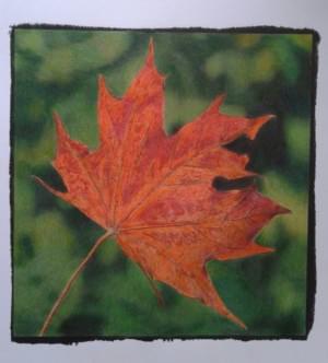
I also don’t have large sets, nor expensive pencils. I used seven different Marco Raffines for the leaves, and assorted open-stock greens (8 in total) (Raffines, Polychromos, Prismacolor Premier and, one Blick pencil and one Lyra Rembrandt) with a hint of black for the background. I also blended the background with a Prismacolor Premier colorless blender marker. The pictures are unedited (except for cropping) and were taken with an older model Samsung smartphone camera. This shows you that, regardless of media and skill level, this book will accommodate.
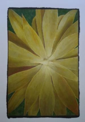
On this flower, I tried something different (for me). I have one set of yellow Spectrum Noir markers that I really hadn't experimented with fully. Since they're alcohol based, they are supposed to blend better than water-based markers, I guess. I didn't get the blending right, so I tried blending with colored pencil over it.
Since I use mostly oil-based pencils and they don't work well with markers (they just slide around on top), I used Solabela, the only non-oil set I have that has a variety of yellows. They're low-end quality, but I was still able to achieve a decent result, imo. I often read that people think they need expensive tools, but this shows that you can work with anything. Still, I think I will stick to colored pencils for grayscaling from now on.